![]()
![]()
| MLS Photography for Real Estate Agents |
|||||||
| Navigate: / home / site map / tutorial / | |||||||
Comprehensive ExampleThis example begins with 3 pictures - take 60 seconds to look at each of the 3 pictures. Instructions to view the full size photos -
1 from each of the 3 angles: 1) Straight on
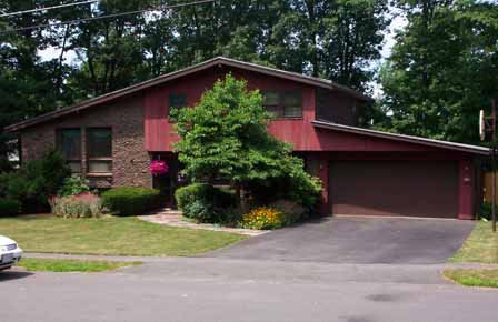
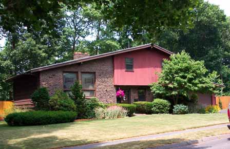
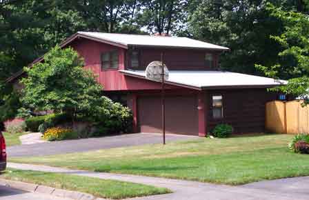
view - un-edited - image size = 1,800 x 1,200 pixels, file size = 753 KB At actual size, these are big images with good color and very sharp detail. The sidewalk, driveway, curb and even the street are all spotless. Did you notice the straight on shot is slightly tipped so the horizon is not level? This will get fixed in the dark room. The next step in the process is to crop. I will give a detailed explanation of how to crop using Photoshop, and then a few brief comments for those who use Kodak Easy Share or some other less sophisticated photo editing software. This is not intended to be detailed/step by step tutorial of how to use the software. I comment on the highlights and try to get you pointed in the right direction. Photoshop - The house side and garage side angle shots just need a simple crop. After opening (a working copy of) the file, the first step is to enter the image size in the crop tool. Make sure you use the correct unit and make sure you enter the correct size for your MLS. In Denver, the correct entry is 448 px / 290 px. After the crop, simply save as .jpg using the low quality setting. The straight on shot is slightly tipped and needs to be straightened out in the dark room. This process is demonstrated on the Photoshop crop example screen shot page. If you have Photoshop and learn this skill, it will make a noticeable improvement in your MLS photos, which in turn makes you a better real estate agent. With Kodak Easy Share (or the free software that came with the camera), you can still crop, but your choices are limited. The goal is to select the choice as close as possible to the desired end result. For example, in Kodak Easy Share, the aspect ratio choices are: 3.5 x 5, 4 x 6, 5 x 7, 8 x 10, 4 x 7, and 4 x 10. As near as I can tell, the best choice for Denver MLS is 4 x 6. I tested this and my conclusion is 4 x 6 is close enough. With Kodak software the human eye cannot detect any problem with the aspect ratio. However, Kodak does not offer any kind of crop at an angle, and in my opinion, this does make a noticeable difference. Below are the 3 final cropped and sized images. The display dimensions are 387 x 234 pixels. This presentation is intended to match what happens in the Denver MLS.
This is an attractive house. Any of these would be fine for the MLS. But which is best? My comments: Straight On View - You could eat breakfast off of that driveway. It is the best looking driveway I ever saw. The garage door is flawless. The overhead trees block out the sky, and this is a good thing - I like the trees and cropped to include maximum trees. The landscape is very nice, especially the hanging flowers at the entrance. The only negative I see is the tree in the center of the shot blocks out the front door. This tree dominates the shot and the tree is not the best feature. I want to emphasize the house and de-emphasize the garage/driveway. House Side View - I like the overhead trees that block out the sky. I like the lawn (although in this shot, the color of the lawn is not great). I like the landscape. And that tree in the center of the shot is now working to de-emphasize (hide) the garage. Hiding the garage tends to emphasize the house - which is a good thing. This is the best picture of the 3. Garage Side View - This is a very good picture, but clearly 3rd best. This shot is all tree and garage with little or no house to be seen. I want to reverse the emphasis. |
|||||||
| You are at the Comprehensive Example page. Navigate: / home / site map / tutorial / |
|||||||
|
Copyright 2006, mlsphotograph.com, all rights reserved |
|||||||


